Monday 2 May 2011

Evaluation of my Magazine

In what way does your media product use, develop or challenge forms and conventions of real media products?


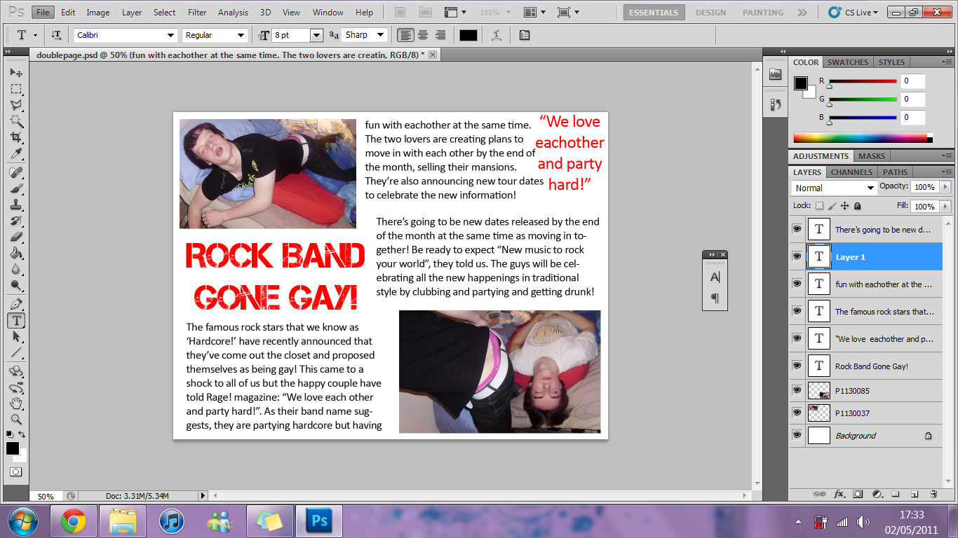
My final pages of the magazine uses many forms of conventions of media products as I researched 3 different ones to find out similar aspects of them all and therefore, what is successful in magazine.By doing this research I was able to copy all the similar aspects of their media products and develop them further or edit them to put on my magazine. For example with the front pages: The mast head is large and clear in the corner with the image using most of the available space with a main cover line over the unimportant parts of the image and smaller cover lines to the side of the main image. I developed this by adding in smaller images to empty spaces to really show the images of the story.

I challenged the conventions of real media products by using a story that would not normally be heard of in the rock music industry - rock stars turning gay. Most stories would be about bands breaking up or their new singles and new yours and new plans, however, I used an exciting and different story to try and capture the eyes of not only my target audience but other people as well.


How does your media product represent particular social groups?

My media product of a magazine represents the rock and heavy metal lovers and all the people who are into rock, indie and heavy metal type music. It includes all the stereotypical rock music lovers who wear dark clothes and wear band's clothing and hide themselves away from the rest of the world unless at a gig or concert. It does this by using colours, such as red white and black. The target audience are associated with these colours and so the colours on my magazine reach out to them when they see it. Also the props used in images and the clothes used help to catch the attention of the target audience.

Who would be the audience for your media product and why?


My target audience for my magazine would be somebody who resembles Alana. She’s 21 years old and lives in the suburbs of London. Listening to music is one of her passions and she most likes rock and indie music, however, she also enjoys a little bit of everything else. She loves keeping up to date with all the new music and bands out and in her spare time she goes to live gigs, festivals and concerts with her friends on the weekends. She also likes to keep up to scratch with fashion and always knows and wears the latest indie, vintage and soho chick trends. Her favourite places to shop are Topshop, American apparel and H&M for some cheap, fashionable clothes. She loves to be loud and talkative and is also up for a good time jumping around in a mosh pit.
An example of Alana would be my target audience as my magazine is about rock music and is therefore, for people who love that music.


How did you attract/address your audience? 

I did this by using the conventional colours of rock lovers: red white and black and by using quite exciting, wild and furious designs. The mast head for example is style to be quite loud and furious which resembles the music and also the name of the magazine - Rage!- is  a direct description of the rock music. It sounds like it has a lot of rage and anger and therefore, the target audience will recognise this and want to buy my magazine. 


What have you learnt about technologies in the process of constructing this product?

When constructing this product I learnt a lot about technology. I started using photoshop to develop images, produce magazine pages and edit/change anything you put on there, for example, images and text and shapes. Without photoshop, the construction of my pages wouldn't have been possible to as high of a standard as they are now. Photoshop can make things look professional and of high quality. 
I also learnt how to use  blog page. I'd never used this before and therefore it was very new and confusing to me. However, after having used it to upload all my research and production of the pages, I've learnt how easy it is to use and how you can use it and what you can use it for.


Looking back at your preliminary task, what do you feel you have learnt in the progression from it to the full product? 


I feel I have learnt how to make a product look more professional. I've learnt that in order to make your product send off the right signals, there are so many small things to do such as colours and images which really help to convey a certain mood and atmosphere. I learnt that researching can really help you to convey the right images and moods and genres. i learnt how taking many photos rather than just a few can give you a wider range and more options for better photos and how the quality of the photo really helps. For example, posing your models to a certain way and the use of props and clothing and make up. All this leads to a better image and better implications of your genre of product. Re-editing all the work can also help as well to make a product better in all aspects. Changing things around and moving to test out every possibility to see what looks best.
My full product is a lot better than my preliminary task as i took all these things into consideration when I was producing my pages. There is always more to be done though and more to be edited and improved which would be learnt through re-doing my tasks in the future. 

The final Front Page

Having researched into magazines, voted on different aspects of magazines and made design ideas, I constructed  my final pages of magazine using everything I had learnt and tried to use my research as inspiration and tried to produce a magazine that would attract my target audience.
This is my final front page:

I took my inspiration from Q magazine which is sophisticated with a rock style. I followed the guidelines of my design as best I could, however, I had to make a few changes as there wasn't enough room on the page. I think my front page is very successful as it follows the conventional style of a rock magazine. The black background with A large red and white mast head really makes it stand out and attracts the eye of the target audience who are associated with red black and white. The main image is quite wild and exciting as is the style of music and so the image reflects on the genre and the target audience. It includes all the aspects of a front cover that the reader would need and doesn't have a cluttered or messy style which some magazines do, such as NME for example. The whole page is really brought together by all the borders around the text and an image by making it seem full and not dull. The story is exciting as you don't hear of it often and therefore it makes many people want to buy it, not just the target audience. The colours red black and white aren't biased towards one gender and so the magazine attracts both male and female. I think it could be improved by chnging the font of the normal text as it looks a bit tacky without a bored.

This is my final Contents page:
The contents page is very simple as there is a lot to read on a contents page and having too much happening around it can make it seem very cluttered and hard to understand what you're reading. It needs to be clear yet effective which mine is. The black background makes the page look fuller and exciting with red and white text rather than being dull. The font of the titles is very effective also as it screams rock genre at whoever see's it which will pull in the target audience. It's also not too vigorous which can look poor and tacky sometimes. The image on the page reflects the story on the front page and is quite exciting and wild which makes the reader want to find the story. It also reflects on the genre of rock as the model is holding a guitar which is associated with rock music. It follows the conventional colours of a rock magazine and the house style from the front page which means the magazine isn't random and the pages aren't out of place, they all fit together. There isn't too much writing or too many images which makes the page untidy and messy and unable to focus on one aspect of the page. From my research, The contents pages are generally very simple with some splash of excitement and I think I've managed to imitate this very well. There were, again, a few changes to the design as there wasn't enough room again, however, I think this works as it means there would have been too much writing compared to images. If I were to improve this, it would again be the tacky normal text on the page that doesn't quite fit in.

This is my final double page spread.

The double page spread is the most simple page of the 3. I've made it with a fairly dull white background and very simple because through the research, I found that all of the double page spreads had just a plain background with image and text. This works on a double page spread though because there is so much writing that you don't want to make things looks to exciting and therefore make the page seem cluttered and full. This would put the target audience off reading it because there is too much happening to concentrate. The right amount of text was used to keep the reader interested without getting them bored of looking at word after word. Also the images used are different and funky and something fun to look at. I've used the same font as on the contents page so that it all matches and again, followed the conventional colours of red, black, and white. The red title and quote and colourful images adds a splash of colour without cluttering the page and therefore I found that my double page spread was quite successful.

Construction of the Double Page Spread

The double page spread was quite simple and easy to make on photoshop as I didn't need to edit any of the pictures and only needed to add text and image.


With the blank canvas, I sized it to double the width of the front page to gain the right size but i left the background white this time to add life to it. The first thing to do was add the images, size and locate them so I could yet again work around them. After that I had to add a title to the page which i used the same font as on the contents page title and the quote so I could add in the story around them. All that was left after that was to add the simple text in as the story.

Construction of the Contents Page

I used photoshop again to construct my contents page. I tried to follow the sketch design that I made, however, there were a few changes in the design.


I started with a blank canvas again, the same size as the front page and had the background black yet again. The first thing I did was to add the image in the desired place and to work around that again. I also put a red border around it to finish it off and give it a better look. Next I used a different 'DAFONT' font to write 'contents' in and added that to the page in the place on the design. After that I used the same font to write in 'features' and 'editors note' to match the title of the page but used different colours. All that was left after that was to add simple text to write the editors note and all of the features.

Construction of the Front page.

I used photoshop in order to construct each of the pages. I started of by making the front page, trying to follow the guidelines in the design that I sketched. 


I started of with a blank canvas and sized it to the shape of a normal magazine. To begin the making, I made the background black and inserted the image so I could work around it as it's the main aspect of the page. To get the effect of them jumping into the page from the blackness, I erased the surroundings of each of the models so it was only their body visible. After that, I used one of the fonts from 'DAFONT' to insert my masthead and used the tools shown to give it a red and white effect. Next I put in the main cover line in a spot where it didn't obstruct the main features of the image (such as the face). I made it interesting by having each line a different colour. Next, I added all the small, simple text including the smaller cover lines, the date and price and the slogan under the masthead. After I'd finished that and inserted a bar code, there was a gap which looked quite empty and dull so I edited a photo into a small oval to fill the gap. This brought the front page together.

Picture Ideas for the magazine

Here are some of the better images I took to use as part of my magazine pages. All the images were taken with the idea in mind of rock stars, bands, party life styles, drugs and alcohol and an "I don't care" attitude to life as this is what the media portrays of rock star celebrities and their life styles. The story i had chosen to do my double page spread on was about two rock stars in a band who turned to be gay and find love in each other. I used this to create scenes of gay rock star lives and how they love to just have fun in their life. I took inspiration from the band Nickelback in regards to how they look and act.

In my images I tried to add props such as musical instruments and I chose outfits that reflected a rock stars clothing. I tried to create images like the above in which they are playing the instruments and general pictures of them. I also tried to capture a party-hard life style.


The images I've taken portray the life style I was aiming for, however, they can be greatly improved. The location of the images could have been in a much better place or even more so, could have been against a background. There is too much going on in the background that it looks cluttered and untidy and makes it hard to distinguish every aspect of the image. This can be improved though by using photoshop to edit out all the unwanted parts of the image.

Analysis of Double page spread Ideas

 The chosen idea to base my double page spread on is idea number 1. I like this sketch as the layout is quite simple and easy to read and very clear to see everything, yet it still looks quite sophisticated and not cluttered. I took inspiration from  NME magazine double page spread by having many images and not too much writing as people will be less likely to read it if there's too much writing. The layout is good as there is an equal amount of images and writing on each page so it's all spread out and looks more interesting and pleasing to the eye. There is a quote box in one corner so people can see it immediately and read one of the more interesting parts of the article.

Analysis of Contents Page Ideas


For my contents page, I chose to design it around sketch number 1. This is because it has all the features of the magazine plus a large image to stop the page looking dull and make it interesting. The title of the page is laid out in a different and original way to most magazines and so it gives the page an edge and seems quite wild like rock music. I took inspiration from the mixmag magazine i analysed as the layout looked very simple but funky and was effective as you could clearly see every aspect of the page and it was easy to understand. I'm going to try and copy the colour style as well with the bold background but a bright colour to give it life.

Front page design Ideas

 These are the designs for my front page. Each of the designs show a masthead, cover lines, feature image and bar code/price. Design number 1 is my favourite sketch because the look intrigues me. The feature image, which was what most people looked for on a cover, is clearly shown in the middle of the page with the main cover line clearly shown below it. All the smaller cover lines are in one place on the left in a clear gap and so are easy to see as well. I used inspiration from Q magazine front cover that I analysed With the mast head in the corner and a clear image in the middle with the cover line below it. I thought this layout was really effective as it shows all the main aspects of the magazine very clearly.


Sunday 1 May 2011

Qustionairre Results

Questionnaire Results


From the results of my questionnaire, it’s become obvious that most people, aged between 16-23 and both male and female, would prefer to read a rock magazine over other genres. This means, when I come to making my magazine, the other factors of the questionnaire will come into place.
I’ve decided to name the magazine ‘Rage!’ as it had the most votes and therefore, was more appealing to the audience. The other design factors that were the most appealing to the audience who took part and that I need to apply to the magazine are:
-Black, red and white colour scheme
-Main models and main stories attracting the audience
-Font type 1
I need to have a main story on the front cover to appeal to the audience and the most appealing story title was:
-“Rock Band Goes Gay!”

Having discovered the favourite genre and what attracts this audience to the magazine, I need to figure out exactly who my target audience are and know everything about them.


Initial Ideas

Initial Ideas for title, colours, fonts, stories and pictures

Initial Idea for Magazine
Having researched 3 different magazines, I’ve decided to make mine based on a rock/heavy metal genre. With a target audience of both males and females, aged between 17 and 24. In this case, I’ll need to make my magazine look interesting yet slightly sophisticates like Q magazine.


Initial Ideas for my Title
Rage! – This title fits perfectly for my rock genre magazine. It connotes an angry, exciting, loud and exaggerated image which rock music also does. Although it’s only word one, it’s short and simple and creates many different feelings. The first thing that pops to mind when you read it is a rock music feeling. It’s different to many other rock magazines as it’s not an abbreviated word and it isn’t initials for anything.

Loudmouth! – This title creates a rock image also and is exciting and eye catching. The interesting choice of words means that many people would look at it, intrigued as to what it’s about, however, the whole title is quite long and wouldn’t have the same effect if it was abbreviated to LM!

RMN – This is an abbreviation of ‘Rock Music Now’ which is quite good for a sophisticated rock magazine, such as Q. It captures a rock emotion to it, yet in a neat way. I like this title a lot, however, it is too similar to magazines such as NME and is a bit too dull for the style I’d like to do.


Initial Ideas for Colours
Red, White + Black – When I thought about a rock magazine, these were the first colours that came into my head. They are stereotypical to rock music and through analysing magazine, I found these to be the most popular colours. The white and black are rock-like but a bit dull so the red brings the colours to life and adds to the rock feeling.

White, Black + Grey – These colours are generally associated with rock and heavy metal but are also a bit depressing and stereotyped towards ‘Emo’ people. My magazine is for a rock/indie genre and although these colours would match, they give off elements of the wrong impression.

White, Black + Yellow – These colours are thought of also when a rock magazine is in mind. The yellow brings excitement to the page and the white and black give off the rock impression. The colours are simple yet would work well and attract the attention of readers. However, the only problem is that the yellow could make the magazine more gender specific towards girls.

                                    
Initial Ideas for Fonts
Idea 1 – I used the website ‘DAFONT’ to find this font as I needed one that would fit into a rock magazine and that would be easy to put onto my front page. The letters are all very bold and block and the way it looks as though some of them are splattered really fits into a rock magazine. This font would attract audiences very well. This is my favourite of the 3 as it has a rock image but isn’t too furious. This font is also very unique and funky in a way.

Idea 2 – This font is also from ‘DAFONT’ and demonstrates a rock genre but in a different way. The letters are all very big and bold and quite scary and have a furious atmosphere. This would definitely attract my target audience but I feel it would take away the attention from the main story liens on a magazine which is mainly what sells the magazine.


Idea 3 – Also from ‘DAFONT’, this font is very big and bold but quite dull as there isn’t anything very interesting about it. The letters are very far apart which make it very clear to read but also not as ‘rocky’ as it should be.


Initial Ideas for Stories
“Rock band goes Gay!” – This story line would be really good to use as it’s not too short or too long and it looks really interesting. It tells you the story without giving too much away and it’s obvious to readers that it’s about a band that went gay. The target audience would find this story interesting as it’s about the rebellious lifestyle of one of their favourite bands.

“Breakout – Going solo!” – This story would be about a band member who left their group to go solo. I think readers would find this interesting and eye catching to read. The quote is short but has excitement in it still.

“From Hating it to Loving it!”  - This story is about an artist who hated life before the freedom of being able to express herself in music. This would be a good feature headline as it makes the readers wonder what was so good and so bad. Also, it creates variation as the magazine will give off an angry, lively feel and the story would be about how an artist is happy again.


Cover Line Ideas
-Top 100 Rock Anthems
-Festival Line Ups
-Fresh Blood – New Bands
-Gigs and Concerts
-Band Break Up!
-Tattoo Spectacular


Initial Ideas for Images
Cover image – My first idea for the feature image is a full body length, long shot, allowing the readers to see the whole person. I think this would be effective and good advertisement for the magazine as you can see what the person is wearing and therefore, what genre magazine. Also, if people see their favourite artist on a magazine they will aspire to dress like them. It also allows for ore personality of the model to be seen and props can be used
My second idea was to have a close up of the models face. This of course would mean a lot of make up to show the personality of the rock genre. It would catch the reader’s eye as it would have a fixed eye line sight to make it seem as though the model is looking into the reader’s eye.
I may also have a couple of smaller images that illustrate the other stories in the magazine.

Content page – On the contents page will either be a long shot or close up (depends on what image is on the front page) of the same model. This will attract further attention towards that particular story and make the reader feel closer to the model.
There will be a few other smaller images to illustrate the other stories in the magazine so that the reader can feel even more interested in what the magazine has to offer. Also, instead of having heaps of writing there will be something else to look at rather than lots of words.

Double page spread – Through the research, I discovered that the conventional magazine has one page covered by a picture of the character and has the story on the next page. This is a good idea as it makes the reader more alert to the story rather than thinking that there’s so much to read. Also, I could use multiple images of the character instead of just one so that there is more to look at.

Target Audience

Analysis of Target Audience
The genre of magazine I’m going to be making is rock, heavy metal an indie. My target audience for my magazine would be somebody who resembles Alana. She’s 21 years old and lives in the suburbs of London. Listening to music is one of her passions and she most likes rock and indie music, however, she also enjoys a little bit of everything else. She loves keeping up to date with all the new music and bands out and in her spare time she goes to live gigs, festivals and concerts with her friends on the weekends. She also likes to keep up to scratch with fashion and always knows and wears the latest indie, vintage and soho chick trends. Her favourite places to shop are Topshop, American apparel and H&M for some cheap, fashionable clothes. She loves to be loud and talkative and is also up for a good time jumping around in a mosh pit. 

Analysis of Magazine Double Page Spreads

 Analysis of mixmag double page spread
Colours
The colours of the two pages are quite interesting as one page is a large picture, mainly of a bright purple and black, and the other page is of the article so is a large white background with black text. These colours work well as it isn’t two pages of dark or two pages of white, it’s one of each and so you get a bit of both which is interesting and exciting. The large black headline with bold pink in the middle really stands out and is eye catching and lively to match the genre of magazine. The black border at the top gives the white page an edge and something else to look at, instead of the page feeling empty.

Design and Images
The design of the pages is good as one page has a large image which clearly shows what the article is about, and the other page is the actual article for people to read, so there’s an equal mix of image and text. The image itself is quite boring as it’s of two people sitting down, however, this makes it clear who the people are and the reader can see this and then get interested in the artists. The other page doesn’t have a simple headline but has a sentence and question which is different and original, just like the genre of music, and then has half a page of writing. Although it has a large title, there is still a lot of writing in the article which could put some people off reading it.

Language and Words
The way the title is written is in quite an informal way. It is very laid back, not classy but not trashy and this matches the genre as dance music is not relaxed, classical music. The article follows a Question + Answer style which is very different to most magazines, as is the music, and this question and answer style makes the reading more bearable as you can read the questions that seem interesting to you. 

Overall Impression
I really like this double page spread as it has the right ratio of image:text and the way the text is written is very interesting compared to normal ways of having an article. The colours complement each other by having dark and light colours to make It not dull but not too cluttered.  The large sentence and question title is really original and different to other magazines which makes the reader more interested.

Analysis of Magazine Double Page Spreads

 Analysis of Q magazine double page spread
Colours
The colours of the double page spread, yet again, follow the house style of red, black and white. Most of the page is white as that’s the background colour but having so much of the page plain makes it look a bit dull and boring. The normal colour of text is black which makes it very easy to read for everybody and so it’s good having the black writing on a white background. In the top corner is a big bold red square which really stands out and gives the page a bit of colour as the image on the page is also very dull and dark and doesn’t stand out much. When flicking through the magazine, this page doesn’t stand out at all and wouldn’t catch someone’s eye.

Design and Images
The layout of the two pages is very similar to NME magazine with the image taking up the whole of one page and half of the other page and text on the right hand side of the image. The images however are very dull and boring and there isn’t much to look at which doesn’t seem interesting. The pages don’t seem to follow a rock theme, however, the do still hold sophistication and class which the magazine was aiming for. In the top left corner is a big red square which disguises some of the white background and gives the page a bit more to look at.

Language and Words
The way the article is written is very sophisticated also and it doesn’t seem like a bunch of words put together. When read, it is very interesting to read because of the way it was written and as there is so little words on the page, you don’t get too bored of reading constantly. The text in the big red square reads: ‘New to Q’. This rhyming seem interesting to the reader.

Overall Impression
In my opinion there isn’t much good to say about this double page spread other than the fact it isn’t cluttered and is clear to see and read. The page is very dull and needs a bit of life to match a wild rock star life. Although the magazine aims for a sophisticated rock style, it still needs more life in it.